Typesetting is the craft of arranging text and images on the page so a book is comfortable to read and looks professionally produced in print. A typesetter turns your finished manuscript into a print-ready PDF, setting the margins, type size, line spacing and chapter openings, fixing the spacing between letters and words, and resolving the small layout problems that make the difference between a book that looks published and one that looks home-made.
It's the step between writing and printing, and it's the one first-time authors most often underestimate. This guide explains what typesetting involves, the terms you'll meet, the rules of good book layout, and how to decide whether to do it yourself or hire someone.
To plan the cover alongside your pages, explore Design your book. Our paperback Cover Builder is available now, with a video to help you get started. The interior typesetting tool is coming next.
What does a typesetter actually do?
A typesetter focuses on the interior of your book, the reading experience, page after page. Their job covers:
- Page setup: trim size, margins and the all-important gutter (the inner margin the binding eats into).
- Type: choosing a readable body typeface, setting its size and line spacing, and keeping it consistent throughout.
- Structure: chapter openings, headers and footers, running heads, page numbers (folios) and the prelims (title page, copyright, contents).
- Refinement: eliminating the spacing faults, bad breaks, widows and orphans that quietly signal an amateur layout.
It's related to, but distinct from, book cover design (the outside) and typography (the broader art of arranging type). Some designers do all three; a typesetter specifically handles the interior layout. If you're typesetting in Word, our step-by-step guide to formatting a book in Microsoft Word walks the whole process; if you want to know how long your finished book will be, the words-to-pages tool estimates the page count from your word count.
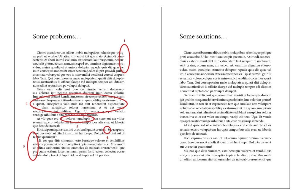
The faults on the left are the usual culprits: hyphenated words stacked on consecutive lines, uneven word spacing, incorrect hyphen use, double spaces, and poor tracking and kerning. Individually small; together they make a page tiring to read.
The typesetting terms that matter
Four terms cover most of what affects readability:
- Point size: the size of the type. Most novels are set around 11 to 12pt. Note that two fonts at the same point size can look quite different in scale.
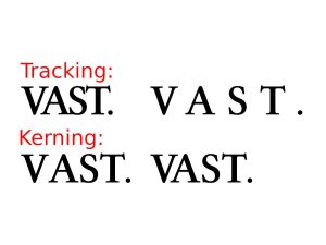
- Kerning: the space between two specific characters, adjusted by hand where a pairing looks wrong (common in large headings).
- Tracking: the uniform spacing across a run of text, used to loosen or tighten a whole block.
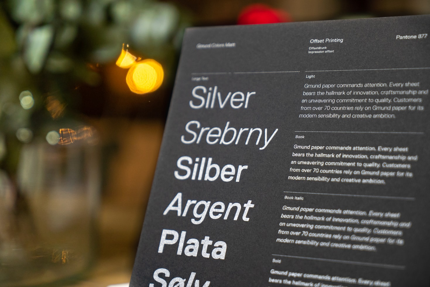
- Leading: the vertical space between lines (named after the strips of lead once used to set it). Too tight and the page feels cramped; too loose and it falls apart. It changes the feel of a page more than almost anything else.
Six rules for typesetting your own book
If you're setting your own interior, these get you most of the way to a professional result:
- Justify your body text. Justified alignment (flush both edges) is the convention for book interiors and looks the most finished, provided your software hyphenates to keep the spacing even.
- Leave generous margins, and add to the gutter. Give the top, bottom and outer edges room, then increase the inner (gutter) margin so text doesn't disappear into the spine. Higher page counts need a wider gutter, see our book sizes guide for trim-size conventions.
- Use a serif typeface for the body. Serif faces (Garamond, Minion, Caslon) lead the eye along the line and are the standard for long-form reading. Sans-serif is fine for headings.
- Kill widows and orphans. A widow is the last line of a paragraph stranded at the top of a page; an orphan is the first line stranded at the bottom. Both interrupt reading: adjust spacing or breaks to remove them.
- Watch for word widows (runts). A single short word alone on the last line of a paragraph looks awkward; tighten the paragraph to pull it up.
- Don't indent the first paragraph. The opening paragraph of a chapter or after a heading isn't indented; subsequent paragraphs are.
These are the basics, enough for a clean novel. Heavily illustrated or reference books, and anything with tables, footnotes or complex headings, repay professional typesetting.
Should you typeset it yourself or hire a typesetter?
Honest answer: it depends on the book and your eye for detail. A straightforward novel can be set well in Word or a tool like Reedsy's by a careful author. The moment a book has illustrations, tables, sidebars, footnotes, multiple heading levels or non-fiction structure, a professional typesetter (usually working in Adobe InDesign) earns their fee, the result reads better and prints cleanly. We don't offer typesetting ourselves, but we work with UK typesetters and are happy to point you to one; whichever route you take, every order with us includes a free file check that flags layout and print-readiness problems before we print.
When your interior is set and exported as a press-ready PDF, you're ready to print. See our book printing services, short-run hardback and paperback printing from just 10 copies (25 for hardbacks), produced entirely in-house at our Exeter facility, or get an instant quote.
Frequently asked questions
What is typesetting?
Typesetting is the craft of arranging text and images on the page so a book reads well and looks professionally produced in print. It covers margins, type size and font, line spacing, chapter openings and page numbering, plus fixing the spacing and line-break faults that make a layout look amateur. It's the step between a finished manuscript and a print-ready PDF.
What is the difference between typesetting and formatting?
In everyday use they overlap. "Formatting" usually means preparing a document's basic structure (styles, headings, page size), often in Word. "Typesetting" is the more refined craft of laying out the interior for print, controlling kerning, tracking, leading, justification and page breaks to a professional standard, usually in dedicated software like InDesign. Our guide to formatting a book in Word covers the DIY end.
Do I need to typeset my book before printing?
Yes, a printer prints what your PDF contains, so the interior needs to be laid out before it's sent. A clean, well-typeset interior is what makes a printed book look published. You can do it yourself for a straightforward novel or hire a typesetter for anything more complex; either way, supply a press-ready PDF and we'll check it free before printing.
What font and size should a book be set in?
Body text is conventionally a serif typeface (Garamond, Minion, Caslon and similar) at around 11 to 12pt, with line spacing (leading) a little larger than the type size. Serif faces are easier to read across long passages; sans-serif is best kept for headings. The right size also depends on your trim size and reader, large-print editions run 14pt and up.
How many pages will my typeset book be?
It depends on your word count, trim size and type size. As a rough guide, a standard A5 novel at 11pt holds about 350 words per page, so an 80,000-word book runs to roughly 240 pages. Our free words-to-pages estimator works it out for your exact word count at any trim size.